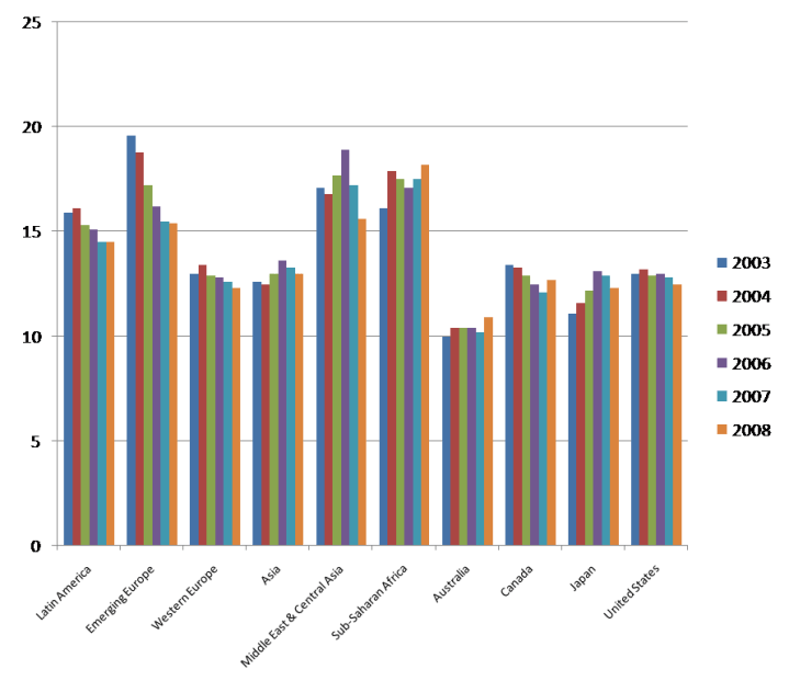
The IMF report had a spreadsheet in the appendix with bank capital levels around the world.
While it has individual countries, I summarised into this chart. The data shows Capital as a percentage of Assets so higher is good, lower is bad.
Note the negative trends in most except Canada, and this is based on the latest data to end of 2008. Use the thumbnail for a larger version that is clearer.


Is there more to their definition of Capital? I was under the impression that Australia had some of the best capitalised banks in the world these days, and yet Australia is depictedas having the lowest.
@Anthony – there are accounting difference between countries so the situation is impacted by the definition of Capital. However I am curious if any other Oz readers care to chip in with a view on the relative strength of their banks.